Before his exhibition I did not know this name. Sounds pretty common, right? Wrong. There is nothing common about this man at all. Creating designs that have sent the fashion world into a flurry, Jones creates beautiful and outrageous hats that are designed specifically to portray a message. Whether this message be about a specific theme he has selected for a collection or the personality of a client, each hat is unique and extreme.
Creating hats for the likes of Kylie Minogue, Dita Von Teese, John Galliano, Christian Dior... he listens to exactly what the client wants and recreates an inspirational design. Each hat is a stimuli and is designed to provoke a response from the viewer but just like a piece of text, each will produce a different reaction for the individual. Some view the radical hats for their form, some for the colours and others for inspiration themselves but however you regard the hats I am sure you would agree also that the way in which he partners together all the elements only adds to the overall performance of what he is trying to achieve.
 Drama.
Everything about the exhibition oozed drama, from the hats themselves right down to the set they had been placed in. Right on par with the colourful man himself, the exhibition screamed for attention. Undertaking a project last year about exhibition design, it was interesting as I was wandering through Jones' work that I found myself ticking things off in my head on the imaginary checklist I had also tried to comply to when creating my own exhibition; presenting the work so as to capture the viewer right from the start, check! Creating an atmosphere similar to the work itself being exhibited, check! Clearing conveying the theme the designer desires, check! For me, everything about the exhibition worked!
The over sized boxes tied in nicely with the hats and the way in which they are given to a customer similar to the way in which they were being presented to us here. Emphasizing the extreme proportions in which Jone's uses when creating his hats, the boxes lay strewn on the floor amongst some over-sized hats. There were four of these hats each representing a different chapter in Stephen Jones' life; Adventure, Science, Rococo and Glamour. Cleverly using these large hats to divide his design journey it was nice to see what had been created in each 'era' in what was for me a witty way to present things in a understandable way.
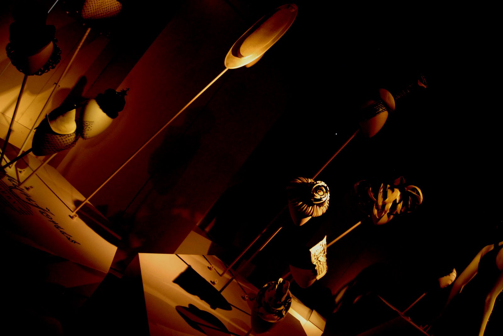
The overhead lighting that was used was an intelligent choice. Creating shadows and adding to the overall drama, the exhibits stand proudly from the lilac hat boxes. The light shines through the hats and generates delicate silhouettes onto the walls and ground. I enjoyed the way in which different forms were created with the effect of the lighting but a friend of mine criticised the lighting because they could not see all the detail. I think this only added to the exhibition as it required you to move closer to the work to see the detailing that may have otherwise been overlooked. Creating this element of interaction, you began to get a feel for Jones' designs and I found myself scrutinising the designs up close, noticing components I may have never have spotted had the lighting been different.
Overall, for me, I felt that the exhibition complimented Stephen Jones' work and the dominating and dramatic context in which the hats had been placed in created an exciting setting. Watching people wander around the exhibition, I was intrigued to see how they interacted with the exhibits and how each was responding differently to what was in front of them. I am sure that if Jones could see what I could he would be very pleased. Struggling throughout his designing life to create an impact, he has finally reached the point he had dreamed of. Still continuing to become more popular it makes you wonder when he will stop becoming more and more dominating...one thing that remains to be asked though, utter genius or completely insane?


