Wednesday, 24 November 2010

Exhibit: Lil' & LARGE

Our hard work for the past 8 weeks has finally paid off and we have now finished our GIDE project.

Lil' & Large.

7 European Design Schools. 1 competition. 1 common theme: Exhibit.

Creating a group of students - 2 Belgian and 2 Scottish - the answer to this question was very varied! Talking extensively about different elements of exhibition design such as interaction and location, we wanted to make sure that we discussed as much as we could at this stage to feel more confident about tackling the brief.
After our group brainstorming session we all decided we liked the idea of a Pop up exhibition, allowing as many people the chance to see it as possible. Most people when they hear pop up would typically think of a book from childhood where the story came alive when the scene spread across their lap...a similar experience we wanted to create with our exhibition.

Playing on the word 'POP UP' we began sketching ideas with this as the underlying concept and from the obvious to abstract.
With a very 'childlike' reference to pop up we thought it appropriate to 'exhibit' a child's clothing range called Oilily, as we felt the brand fitted well with our pop up concept. The brand boasts an impressive range from dresses to handbags decorated with bold patterns that are instantly recognisable.

Presenting a mood board a few weeks into the project we were able to highlight our inspiration for our
design. Creating an unconventional mood board, we talked about our ideas using the elements of a pop up book. Created with interaction in mind we wanted to heighten the understanding of our theme through interaction. Research images were on a pull out slide and to see all of these you had to slide and also flip the card over. Within our group we created large 'sketch book pages' and scribbled all our ideas relating to our topic trying to create visually what we interpreted the term pop up to be. Naturally everybody had different ideas surrounding pop up so we tried to incorporate these elements to create the strongest concept. Looking at the way in which a Russian Doll is able to transform itself from being one object into many without a drastic change in form was something that we used as inspiration for creating the form of our pop up exhibition.

Obviously with our pop up requiring to be moved to different locations we had to consider issues such as weight, stability, materials, portability and size. Attending a recent furniture exhibition in Kortrijk, Belgium we were able to gather information about the different types of materials that were available to us and what sort of attributes they possess but also discuss the problems we were facing with these issues and the
problems that these designers had overcome. The material that we have decided to use is CARDBOARD. BEE®lite manufacture high quality honeycomb panels that can be used for both temporary and permanent purposes. These panels are lightweight which are vital for an exhibition that will constantly be on the move and can be erected quickly as there are no tools required. The Oilily pattern will be printed on the outside of these with each building being a different colour and the interior space will be colourless to allow the clothes to ‘pop’ from the backdrop.

All the ‘houses’ are separate so as the exhibition can be altered to suit the location it will be situated in. From old buildings to shopping centres to art galleries, small or large the design allows the exhibition to accommodate for all the different locations that we intend to visit and give people the chance to experience the exciting brand that is Oilily.

Final board...coming soon.

Tuesday, 23 November 2010

Furniture made to measure

New project. New brief.


Another group project at Lessius in which we have to design the new STIPhuis. The STIPhuis is a place for students to go if they have any problems but is mainly used by international students who wish to voice any concerns and also do laundry. The current STIPhuis is too small for the functions it is required to perform and is to be located to a new, larger building 3 doors down the street. It's our job as designers to communicate and work with both the clients and users to best utilise the new space.

Using some of the techniques I learned last year as research methods we were able to gain an insight into the users of the space. Asking the STIP staff members about the STIPhuis they currently worked in, we asked questions such as what do you require from the space? What works within this current space? What would you like to see within the new space? Taking these results into consideration we took this forward when creating our space.

Friday, 12 November 2010

Capturing Slovenia.


Delving into my world of thoughts...

Dissertation.


Part 1.
Identifying 8 key words from the core theme of 'crime and design' I was able to think about my topic in more detail and highlight areas in which I might look into further. After meeting up with other classmates, the ideas I jotted down were discussed further and I was able to reinforce points to them that I felt were important to the whole core theme.


Part 2.
Selecting criteria in which I wanted to take forward and possibly explore allowed me to create a list in which I thought points on it would prove useful for further research. Looking more closely at methods which have been successful/unsuccessful into crime prevention, aspects which cause an individual to act in a certain manner within an environment...

Part 3.
Questioning what I had already explored allowed me to look into more detail parts I thought were most relevant to the points that I wanted to continue look at. Asking myself questions I could begin to answer these using parts of the research I had already gathered looking into the theme of crime and design.


Part 4.
Looking at things in a more refined view and breaking down the topic into smaller chunks I could begin to select parts which were most relevant to me. Detailing parts such as further research I could do and people I would need to speak to got me realistically thinking about the whole dissertation process.

Capturing Spain.


Bio.


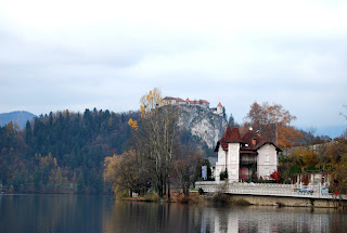
Recently on a trip to Slovenia, I attended an exhibition titled Bio. where all the designs inside were supposed to be kind to the environment in some way. For me, this was one of the worst exhibitions that I had been to. The layout of the whole exhibition was very unusual and you had to back track on yourself constantly to try and see everything within the space. The way in which things were also presented were not exciting for me and what could have been an exciting display of 'sustainable' designs was now something that was quite tedious to read about. Instead of being encouraged to interact with the designs, we were stopped from touching. This is something that I think should be changed within an exhibition space. How can we truly appreciate the design if we cannot use all our senses to interact with it. At Bio. a small girl was playing with a plastic form but instead of being encouraged to experience the design she was told off and ran scared to her mother... One thing that I did like at the exhibition though was a piece of furniture design that used the human form to create a modern design. Drawing inspiration from hands clasping while praying, the Bosnian designer used the simple interaction of fingers to create a self supporting seat. While looking at this piece of design it reminded me of the Spanish designer, Santiago Calatrava, who also uses the forms of the human to create beautiful structures that has gained him the title as being one of the 'elite' designers in the world.
The spine.

With thanks:
http://images.google.com/imgres?imgurl=http://facesofdesign.com/files/image/Competition%2520Logos/bio%252022/bio_teaser.jpg&imgrefurl=http://facesofdesign.com/design-competition/bio-22-design-award-biennial-of-industrial-design&usg=__zkCU43g0ZrLlj-sFd-rAkDaZ1jU=&h=192&w=325&sz=9&hl=en&start=106&sig2=PRHa7IjVFXd1ZfmMvnioOQ&zoom=1&tbnid=JT2LYwlb4RdHEM:&tbnh=138&tbnw=195&ei=9k3kTN-CMpCZOvL2uZIB&prev=/images%3Fq%3Dbio%2Bslovenia%26hl%3Den%26biw%3D1280%26bih%3D585%26gbv%3D2%26tbs%3Disch:10%2C2351&itbs=1&iact=rc&dur=374&oei=603kTPmuEsyUOvKpiZMB&esq=5&page=6&ndsp=21&ved=1t:429,r:0,s:106&tx=81&ty=44&biw=1280&bih=585
http://images.google.com/imgres?imgurl=http://archrecord.construction.com/projects/bts/archives/tallbuildings/08_HSB/images/1.jpg&imgrefurl=http://urbantoronto.ca/showthread.php%3F4545-Arch-Record-Building-Type-Study-on-Tall-Buildings&usg=__JzGRCXSLZ1xqoUJpx35_5IGfi4I=&h=400&w=310&sz=82&hl=en&start=0&sig2=lodkyZkLP6It3-oFSJf76w&zoom=1&tbnid=RTuMJ968rby7HM:&tbnh=128&tbnw=100&ei=t03kTNj9H8WgOuO6uJIB&prev=/images%3Fq%3Dcalatrava%2Bspine%2Bbuilding%26hl%3Den%26biw%3D1280%26bih%3D585%26gbv%3D2%26tbs%3Disch:1&itbs=1&iact=rc&dur=411&oei=t03kTNj9H8WgOuO6uJIB&esq=1&page=1&ndsp=21&ved=1t:429,r:17,s:0&tx=69&ty=85