Imagine a City without lights.
This happened in Brazil this month when there was a large power cut that left cities like Sao Paulo and Rio De Janeiro in complete darkness. Instead of the street lights providing the light it was the drivers in their cars that lit the cities.
As hosts of the World Cup in 2014 and the Olympics in 2016, should we be worried that the same should happen again? Imagine the World Cup Final. The game hasn't been won in normal or extra time so has now gone to penalties. A Spain and Holland Final. So far both teams have scored 4 each. Holland's Van Persie missing one after a great save by Casillas. Torres places the ball on the spot. All eyes are on him. He steps back slowly, looking up at the crowd. He stops. Starts to run towards the spot...DARKNESS! How awful would that be?!
It is only at times like this that we realise how much we rely on light but there is something quite beautiful about the above photograph. A city in darkness looks like an almost different place.
With thanks:
Photo: http://english.aljazeera.net/news/americas/2009/11/2009111132727141870.html
Sunday, 29 November 2009
City Life
Most Cities are famous for their stunning light displays...Take Paris for example.
When I visited this beautiful city in June this year I was surprised by how much of the sight-seeing could be done at night as well as during the day.
The Eiffel Tower - attracts over 6 million visitors a year and can be seen from miles away, probably the most famous landmark of France. Most people will climb this during the day, including myself but although I enjoyed climbing this and viewing Paris from 273 metres above the ground, for me it was at it's most spectacular at night.
Lit by 350 sodium vapour lamps the tower glitters in the dark but what makes it extra special is for the first ten minutes of every hour the Tower sparkles. Breathtaking.
Friday, 27 November 2009
Caja House
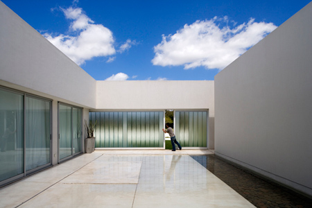
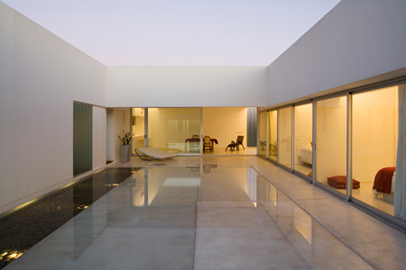
One of the easiest shapes that a designer could probably start with is a box and that is exactly what Estudio Aire have done.
The main focal point of the design is a courtyard with all rooms of the single storey house overlooking it. In what might be referred to as a design that cuts you off from the outside world and something very private, the designers still allow for a degree of privacy but are also able to bring the outside in. The use of water in the courtyard reflects the sun and sky but also the lining rooms have glass windows to allow the light to shimmer.
For such a confined space the house feels spacious and light – a trick adopted by the designers to create a sleek and modern design.
To see more, click here to go to the Dezeen website.
With thanks:
Photo: http://www.dezeen.com/2009/11/02/caja-house-by-estudio-aire/
Wednesday, 25 November 2009
Impressions of Dundee...
A photography competition that took place in June/July this year asked participants to capture their impression of Dundee. What was quite surprising was that each photograph shown in the online exhibition was completely different from the previous - no one's perception of Dundee was the same. For me Dundee is all about the waterfront. I travel to University everyday and the first thing that I see in the morning and the last thing at night is the Riverside. This runs the length of the Tay and as you approach closer you can see from Broughty Ferry right to the edge of Dundee. There is nothing nicer than leaving the city at night though and looking back to see the City's lights glittering in the Tay.
For some people in the competition it was about the people of Dundee. Others it was the unusual building shapes...have a look for yourself and see if your impression of Dundee is similar to anyone elses.
Click here for Photography Exhibition.
With thanks:
Photo: http://www.geograph.org.uk/photo/52780
http://www.dundee.ac.uk/externalrelations/photocompetition/exhibition/
A random fact...
75% of the annual sales of these are in the 6 weeks running up to Christmas. What are they?
Can you get it?
The answer...is Cd's.
To refer back to an earlier post that I wrote "Why we buy", I talked about how advertisers are able to influence us to buy things by the placement of things in stores, etc.
Are the sales of the Cd's so high at this time of the year because of advertisers? Are they influencing us into buying these for our loved ones?
Cartograms
Cartogram: a map where land area is substituted for another variable e.g. Gross National Product (GNP), Population, etc.
The map above highlights the vast difference in GNP between countries and the map below shows where densely populated parts of the UK are.
There is something that I really like about these cartograms and as soon as I came across them, they immediately caught my attention.
To look at more cartograms, click here.
With thanks:
Photos: http://www.worldmapper.org/
The 'Greatest' gadgets invented?
I came across this article about the greatest gadgets ever invented and although I agree with some on the list. Others, well...are they really the greatest?
As you would expect things on the list include the colour television and mobile phones with cameras. Some people might say well okay these are good inventions but they are not essential...try telling my mum that who is obsessed with Coronation Street and all those people fixated with getting the next facebook profile picture.
One thing that did strike me that was on the list was the eBook. For me books are something quite special as they remind me of a childhood where, yes I'll admit it, I was a bit of a geek and loved reading. Nothing could beat the noise of the spine on a new book cracking and the smell of the new pages as you flicked through the book. Surely something electronic just takes the whole concept of books and turn it on its head?
Why would anyone want to spend hours in front of a tiny screen reading a book that they cannot feel in their hands?
I suppose the up side might be that your bag isn't as heavy carrying loads of books around with you but surely if a book is worth reading it is worth a carry...
Tuesday, 24 November 2009
Frank Gehry
Hotel Marques de Riscal
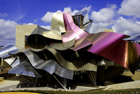
Surely making your work accessible to the public is the most important thing a designer can do but Gehry limits the audience that can view his buildings by not placing disabled access to his buildings. There was an uproar when the gallery above was built as Gehry removed disabled ramps to 'better' his design. This seems a little bit unfair and I know that if I was in Gehry's shoes I would want as many people as possible to see my designs.Unusual, contemporary, modern: all words associated with Frank Gehry's designs but for me though there is something very different about them. Obviously they are not the usual type of buildings you would see and clearly it is not just me that thinks this as many of his buildings have become tourist attractions.
Although the majority of people I speak to like Gehry's quirky designs there are some that don't think they are as special as they are made out to be. Coming under a lot of criticism, these distinctive buildings do waste a lot of material and at a time when designers should be more conscious of the materials that they consume Gehry seems to ignore this.
With thanks:
Photo: http://artlitideas.wordpress.com/2009/03/
Photo : http://www.cbc.ca/canada/toronto/story/2008/11/17/ago-attendance.html
3 Graphic Designers...
While I was helping out at the DJCAD open days I was made aware of all the different disciplines that take place in Duncan of Jordanstone but one that really interested me was the graphic department. Here I was told about a video that appeared on YouTube, 3 graphic designers who had to recreate a war scene.
3 Graphic designers + car + some uniforms, e.g. jackets, helmets + rope + guns + video camera + 4 days
The films shows you how the final piece was constructed and the results, in my opinion, are really good!
See what you think for yourself...
If you can't view the view, click here to see it on YouTube.
With thanks:
http://www.youtube.com/watch?v=WRS9cpOMYv0
Monday, 23 November 2009
Design taking on a new element
With designers under constant pressure to make their designs more sustainable, it was only a matter of time before someone took the brave challenge of designing a kinetic building. Mad? I think so.
Over recent years, Dubai has taken on the reputation for being a desirable place to build 'architectural wonders'. Viewing these new beauties by the crane of the neck, many tower above the skyline.
Designers like to make statements but instead of making a taller building than the last, some are now making 'greener' designs.
Imagine a 59 floor building that could not only power itself but 10 times over. This is exactly what architect David Fisher has done. The building he proposes to build will power itself using the sun and wind and will be capable of rotating around a central axis.
Imagine staying in this building, waking up one morning looking over the city, next morning waking up looking over the ocean. Something that you wouldn't need to dream of...this would be a reality.
This area of the world is susceptible to hurricanes and earthquakes but Fisher assures that the giant is able to withstand these forces as each floor can individually move.
Click here for further reading.
With thanks:
http://www.inhabitat.com/2008/06/09/rotating-wind-powered-tower-to-begin-construction-in-dubai/
A Blast from the Past.
New images have been published of wartime aerial photographs. These photos are very interesting as they show us a different perspective of war.
With thanks:
http://aerial.rcahms.gov.uk/
.
Tours - Parcay Airfield, France
Many countries still to this day bare the visible scars that the war caused, something that people might walk past everyday and not even realise. We could be walking through the battlefields and be unaware of the violence and heartache that took place there.
Karlshagen, Mecklenburg - Vorponmmern, Germany
Its seems a little strange that something that caused so much devastation and damage could create something so beautiful.
With thanks:
http://aerial.rcahms.gov.uk/
.
Flooding
I thought it would be appropriate to blog about the recent flooding that has occurred in Britain, specifically Cumbria.
Cumbria was hit worst in 2005 by flooding and now again in 2009 is one of the worst places to be hit again. Why are we not learning from our mistakes?
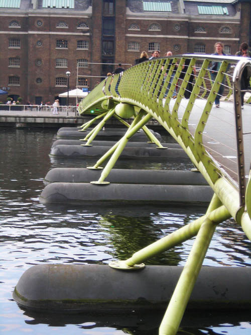
The main problem of all this flooding is that bridges are collapsing under the sheer pressure from the rain water. With Cumbria having 1,800 bridges surely it is important that this issue should try and be resolved? Possibly creating floating bridges maybe?
This floating bridge has been constructed on North Quay/West India Quay, London.
As the water level rises so does the bridge and as the water moves the bridge does too.
This may not be the answer to Cumbria's problems but maybe something similar should be designed to help people.
With thanks:
http://www.darkwaters.org.uk/piers/canary-wharf-pier/
Sunday, 22 November 2009
Juteopolis
Recently I have just finished my first project of second year, titled 'Juteopolis'. In an earlier post I explained a little about this theme and a little about the progress I had made. Now on the completion of the project I thought it was good practise to look back on the experience and be quite critical.
Task: Design an exhibition space for the DCA based on the theme of Juteopolis.
This project was the first after a long summers break but not only that it was also a group project. This was such a good opportunity for me as a designer to learn how to work in a group with different people and practise skills that could be used in a group. Things like listening to people's opinions, splitting tasks, recognising people's strengths and assigning tasks to them as best as possible. This was such a learning experience for me but something that I really enjoyed.
So as I explained before our group decided to focus on the connections that the jute industry brought to Dundee - not only through the industry but also the friendships that were made. A shocking fact that stuck in the mind of our group was that on average 8 people shared a house. Using this as the main idea behind our exhibition design we looked at many different ways that we could communicate this idea and the common occurrence was that of cubes. The cubes representing the cramped tenement housing.
Above all of this we had to consider aspects that we had never been asked before to think about. Sustainability, transportation...
In the end we made an exhibition space based on 8 cubes that all connected, each made from cardboard. This may seem as an obvious solution to the sustainability element as it is a material that can be recycled but actually this material provided a solution to both the problems of sustainability and transportation as cardboard is lightweight and due to the size of some of our cubes it was crucial that they did not weigh too much.
Each cube conveyed their own idea, (almost like a family member's perspective) some more obvious than others and allowed high levels of interaction.
Presentation boards:
Rock 'n' Roll
Flicking through the newspaper I was intrigued by the images that I was presented with. At first glance the images looked like paintings but then when I began reading the article I realised that these images were not what I thought.
I was looking at real life rolling stones that could move hundreds of metres on their own!
In the intense 50º heat of the Californian Death Valley these rocks appear to wander around the desert in lines, leaving distinctive tracks in the sand.
With some of these rocks as heavy as 113kg it is hard to imagine these rocks moving without help, but it does happen! Scientists believe that a combination of elements push the rocks along the desert floor (90mph winds, ice formations at night and thin layers of wet clay on the surface of the desert).
These gliding rocks though might not be around for much longer as many believe that the rising temperatures could lead this phenomenon to disappear!
With thanks:
Photo: http://www.indianpad.com/pics/86016/pic-the-mysterious-moving-rocks-of-californias-death-valley/
Labels:
Calafornian Death Valley,
Climate.,
Rocks,
Roll
Home is where the heart is? ♥
A lot of people refer to home as where their heart is, but where is home…? Is it where you live now, a place you grew up, where your parents stay now, where you wish you were…? Is it a building, a country, a town or simply a place where your familiar surroundings are?
A discussion I recently attended by Mhairi Bowe at the Sensations Science Centre in Dundee talked about psychology in the home. Predictable stereotypes of the word home like safe, familiarity and belonging were turned on their head within the first five minutes and we were asked to think about home in a new frame of mind. Talking about the past, present and future we were asked how this affected us.
Places have an emotional impact on us. By linking these emotions to the past, we can revisit these store houses (physically or mentally) and relive the memories we choose to. These strong emotional connections that we make may be meaningless to other people but to us they are personal.
By losing a place we are made to realise how much it meant to us. I am lucky in the sense that I have only ever lived in two houses my entire life. The first house I stayed is not far from where I stay now but because I moved to my present house when I was only one years old I can’t actually remember anything about the old house. Now I couldn't ever imagine moving away from my house, but why do we get so attached? So many things have happened in this house. Birthdays, Christmas’, special celebrations, etc.
Although we get attached to places, it is important sometimes to move on and find new comforts. Although moving out of home is a daunting prospect, it is also quite exciting wondering where I will end up.
Although my heart will always be in my childhood home, I hope that a new place someday could also share a piece too.
With thanks:
Photo: http://oels.byu.edu/student/idioms/proverbs/home.html
Why we buy...
Ever noticed that the essential things you need like bread and milk are always hidden at the back of the supermarket? This is no coincidence, supermarkets are purposely designed like this. How many times do you go into a shop with one or two things on your list and then how many times have you walked out with bags full of things you don't even need? (sometimes even forgetting the very thing you went in for!)
The book "Why we buy" by Paco Underhill, observes how we as humans respond to certain things. The results were very interesting, for example if you keep someone in a shop longer and if people shop with baskets they are more likely to spend more. Okay so you might be thinking yeah that's all pretty interesting but that's just common sense, well how about Primark. There are loads of folded displays where you have to look for your size, Underhill explains that we are more likely to buy something if we touch it. So by unfolding the clothes we are more likely to buy them out of guilt (consciously or subconsciously) than if they were hanging up. As much as I hate to say this I am guilty for this...Just after this lecture I went to Primark and bought some tops (after unfolding them). I knew fine well I was falling into the trap but I couldn't help myself.
We have all fallen victims to the advertising giants!
Labels:
Advertising,
Primark,
Supermarket,
Victim,
Why we buy.
Saturday, 14 November 2009
Is it art?
The Chelsea Flower Show is highly competitive and full of wonderful compositions of flowers…that was until James May turned up. Normally found behind a steering wheel on the television show Top Gear, James May has recently taken part in a small series of television programmes called Toy Stories. In this he brings back childhood pastimes to the present day and tries to encourage modern day children to become excited and take part in his experiments. In the second episode May tries to enter the Chelsea Flower Show with a garden made entirely of plasticine. He enlists the help of high school children, art students, ex-soldiers, etc to create a ‘masterpiece’. Nicknamed “Paradise in Plasticine”, the final result isn’t quite as bad as I thought it would be and May’s garden even went on to win the RHS ‘Peoples Choice’ award for the best small garden – not bad for a garden that was completely fake!
With thanks:
Photo: http://golondon.about.com/od/rhschelseaflowershow/ig/Urban---Courtyard-Gardens-09/Paradise-in-Plasticine-1.htm
Photo: http://www3.pictures.gi.zimbio.com/RHS+Chelsea+Flower+Show+Opens+Gates+Public+3t8YDmwDJ3Fl.jpg
Friday, 13 November 2009
Sustainability
Okay so I know the title has so much different ideas behind it and so many talking points but one thing I didn't realise it could relate to so much was food!
Early expectations of a talk I attended was that it would relate possibly to how we as designers could think harder and develop products that are friendlier to the environment...never assume!
Two hours was spent on educating us about our food waste and how that this was having devastating effects on our environment. Now, don't get me wrong this is all very interesting and as a designer everything is relevant to us but when you are not expecting this, you are caught a little off guard (and judging by the looks from my friends they were equally as surprised as me).
The underlying theme (and something that is very relevant to everybody) is that every action we take can have a knock on effect to the planet. Without sounding like an Eco-obsessed maniac, we as designers should be more conscious of our design decisions and also apparently we should celebrate ugly vegetables!
With thanks: Sustainability talk, Enterprise Gym, Dundee
Photo: http://www.provokator.org/files/ugly_carrots.jpg
Wednesday, 11 November 2009
Context and Design
Recently I have gained a deeper understanding of just how much context effects design... Gaining information for my last task in the design studies assignments I began to truly understand how different environments provide different reactions to art and design. An example of this would be graffiti. Some people see this as a piece of art while others see it as vandalism, but why is this?
Context. Depending on many factors, e.g. where you were raised, what was happening in the environment around you, what you were interested in as a child, etc, these would all play part in how you respond to things. Personally for me I think graffiti is art, purely because it is not always just a spur of the moment thing. Some 'designers' think about where to place their graffiti for the best response and how to layer things so that some parts jump out and capture the viewer. Graffiti gets a better response in some areas than others so it is important for this to be taken into consideration. Graffiti is a platform for people to raise issues important to them so we as designers have to be careful about which we show case our design as some people may not respond how we want them to...
Sunday, 8 November 2009
Assigment 3: Secondary Research Skills
Birkbeck, C & LaFree, G 1993, ‘The situational analysis of crime and deviance’, Annual Reviews Inc., vol. 19, pp. 113-137.
Journal discusses the idea that crime and deviance are either situational or dispositional. This could relate to the context and upbringing of an individual and their susceptibility to crime.
Cassidy, T 2003, Environmental Psychology, Psychology Press, East Sussex
This Book provides an understanding how physical and social factors are linked to human behaviour and experience. Designers need to understand about an individuals response so as to create the best design. This book would be useful for a greater understanding on how people react differently to design.
Fowler, E.P. 1987, ‘Management and city design’, Social Forces, vol. 66, no. 2, pp. 365-389.
Explores the relationship between human behaviour and physical environment. Does this have any relation to how we as individuals respond to different things, e.g. design, graffiti.
Jarjoura, G. R., Tripplett, R.A. & Brinker, G.P. 2002, ‘Growing up poor: examining the link between persistent childhood poverty and delinquency’, Journal of Quantitative Criminology, vol. 18, no. 2, pp. 159-187.
Journal discusses the research that suggests poverty and delinquency are related. Upbringing of individual could be responsible for increasing chances of becoming involved in delinquency.
Krivo, L.J., & Peterson, R.D. 1996, ‘Disadvantaged neighbourhoods and urban crime’, Social Forces, vol. 75, no. 2, pp. 619-648.
Talks about areas of poor poverty and the high levels of crime – related? Useful for highlighting that some areas are worse hit than others for crime e.g. graffiti - possibly an explanation to this.
Leventhal, T & Brooks-Gunn, J 2003, ‘Children and youth neighbourhood context’, American Psychological Society, vol. 12, no. 1, pp. 27-31.
Discusses the neighbourhoods in which we are raised and their effects on personality. This in turn could affect how we respond to design so may be useful in understanding the influential things responsible.
Mackintosh, P.G. 2005, ‘The development of higher urban life’ and the geographic imagination: beauty, art, and moral environmentalism in Toronto 1900-1920’, Journal of Historical Geography, pp. 688-721.
This journal talks about how art can shape human behaviour. Relates to context and setting discussed in Brainstorm. Although this source was only published in 2005, the content is from 1900-1920 and may be slighted out of date for what I am to discuss.
Manco, T 2002, Stencil Graffiti, Thames & Hudson, London.
Discusses the history of graffiti and why ‘artists’ choose to participate in this illegal game. Might prove useful if talking about why people use graffiti as a means of communication. Also looks at specific areas where graffiti is e.g. London and Brooklyn.
Smith, S.J. 1984, ‘Crime and the structure of social relations’, Transactions of the institute of British Geographers, vol. 9, no. 4, pp.427-442.
Talks about how lifestyles and community patterns effect crime. Some areas are more susceptible to crime than others and this journal tries to help and explain this. Might be useful in trying to explain why people graffiti and commit crimes in certain areas more than others.
Stephen, S 2006, Designing safer places, Edinburgh, The Scottish Executive.
This report from the Scottish Executive talks about the different measures that are being taken when designing communities. Small changes in the way in which thing are built can have a lasting impression on our neighbourhoods. This would be useful in looking at specific examples of prevention of crime, etc.
Taylor, R.B. 1996, ‘Neighbourhood responses to disorder and local attachments: the systemic model of attachment, social disorganization, and neighbourhood use value’,
Sociological Forum, vol. 11, no.1, pp. 41-74.
Discusses how neighbourhoods respond to disorder and the social involvement among them. Important areas may be researched into how communities respond to things. Different neighbourhoods have a different mix of people living in them and these are presented.
Part (b)
Website sources (discipline related):
Dezeen Architecture and Design Magazine:
http://www.dezeen.com/
Wired news:
http://www.wired.com/
Royal Academy of Arts:
http://www.royalacademy.org.uk/
RIBA:
http://www.architecture.com/
Yatzer:
http://yatzer.com/
Website sources (Non field related):
Science News from New Scientist:
http://www.newscientist.com/
Red Jotter:
http://redjotter.wordpress.com/
The Guardian:
http://www.guardian.co.uk/
BBC News (includes Television and Radio):
http://news.bbc.co.uk/
National Geographic:
http://www.natgeochannel.co.uk/
Wednesday, 4 November 2009
Has furniture lost it's value?
'Back in the days' when my mum and dad were 'wee bairns' furniture was seen as something more of a practical form rather than a design statement. Weeks sometimes even months was spent saving for furniture and even then it wasn't always new. Now we can go into IKEA and come out with furniture that can fill almost an entire house. Ask anyone back in the 60s about flat pack and their response might be a load of wolves run over by a tank... Not what we would think of when asked what flat pack is today! Why is it now then that we are filling our homes with 'cheap' and wasteful furniture? Has furniture lost it's meaning?
We can spend pennies on furniture now but is it just as good as before? Well no, in my opinion, it's not. Planned obsolescence is an important factor for designers now who intend for the furniture to last only a few years rather than a lifetime. Old furniture grew up with the family and it was never replaced - it in turn was almost part of the family. We are now leading a very disposable life! It's all fine that we have taken a stance to cut our carbon footprint and recycle paper and cans but how can we really try and help when we still being wasteful with our furniture consumption? Furniture in my opinion no longer has meaning - it is just something that fades into the background and is there for the short term until a new trend comes around and we replace it again...a vicious circle?
With thanks:
Photo: http://www.kitchenandtabletop.com/img/ikea_urban_chair.jpg
Subscribe to:
Posts (Atom)